
Forbidden Island, a cooperative board game by Matt Leacock, is well-loved by my family and our go-to pick whenever we get together. This project is an exploration of what a digital version of the game might be. While there is an iPad app for Forbidden Island, I wanted to stretch my desktop design skills by creating a new variant for the computer. I was also inspired by other computer versions of board games that I think were designed well, such as Tokaido and Ticket to Ride.
Forbidden Island® was created by Matt Leacock and published by Gamewright®. All credit for the game's rules, mechanics, content etc. go to them.
Project Overview
The Brief:
To design a desktop app version of the Forbidden Island board game.
Key Tools and Deliverables:
• Used pen and paper to create physical mockups and a paper prototype.
• Used Sketch to create user/design research deliverables (journey map, personas, user stories, red routes, mental models etc.) and digital mockups.
• Used Axure to create and test a digital prototype.
• Used Adobe Photoshop to create custom icons.
• Used Sketch to create user/design research deliverables (journey map, personas, user stories, red routes, mental models etc.) and digital mockups.
• Used Axure to create and test a digital prototype.
• Used Adobe Photoshop to create custom icons.
What I Did:
As the UX/UI designer on the project, I:
• Interviewed users, defined main user types, and generated personas.
• Mapped out the primary workflows, user journey, and user stories.
• Researched and applied appropriate information architecture, mental models, and UI patterns.
• Gathered design inspiration, defined color palettes, and interpreted design principles.
• Created, tested, and iterated on a physical prototype that focused on player movement.
• Created/tested a digital prototype that focused on performing the max number of actions per turn.
• Performed affinity mapping and prioritization of user feedback, then implemented changes to each prototype.
• Designed the high fidelity mockups.
User Research
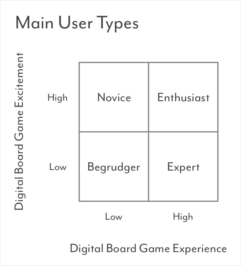

Normally I would use pictures of people in my personas, but I couldn't resist using the four treasure pictures since they are such an integral part of the game.
To start my user research, I interviewed people I knew who had played a board game at least once. I asked them questions about their experience with board games, digital board games, and Forbidden Island in particular if they had played it. After reviewing my answers, I found the greatest variation to be in their experience with digital board games and their excitement about them. This neatly separated everyone into four major groups, which I called the Novice, the Enthusiast, the Begrudger, and the Expert. I then applied these user types to four personas, and ranked them according to what I believe would be the target users for Forbidden Island based on its simple gameplay mechanics layered on top of a deeper strategy/communication component.
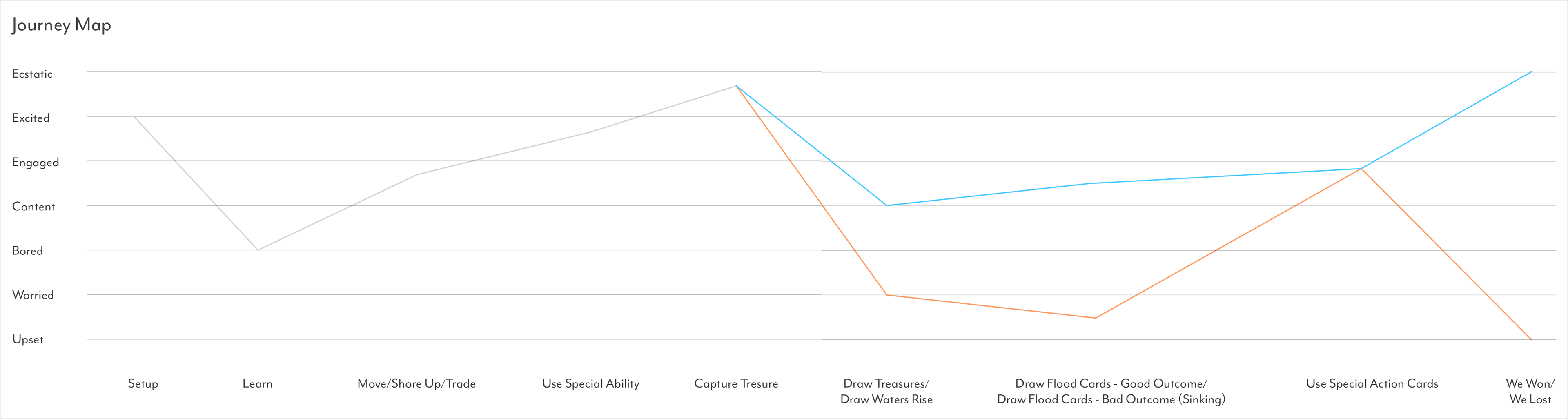
Next I wanted to create a simple journey map to capture the users' feelings during each step of the game. Seeing the key high and low points helped me think through how I would support those points in the design – for example, harness the anticipation of drawing cards or the excitement of capturing a treasure. I thought it was also important to show the two emotional paths that can occur depending on if the card you draw has a good or bad outcome.
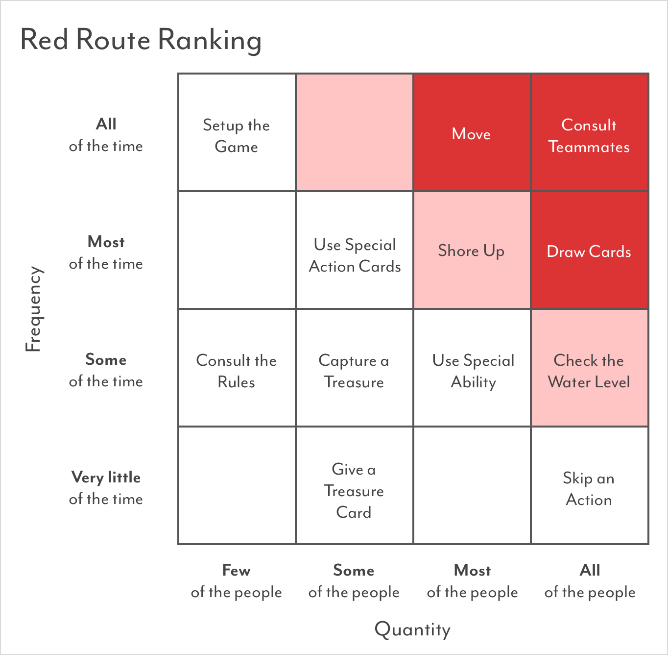
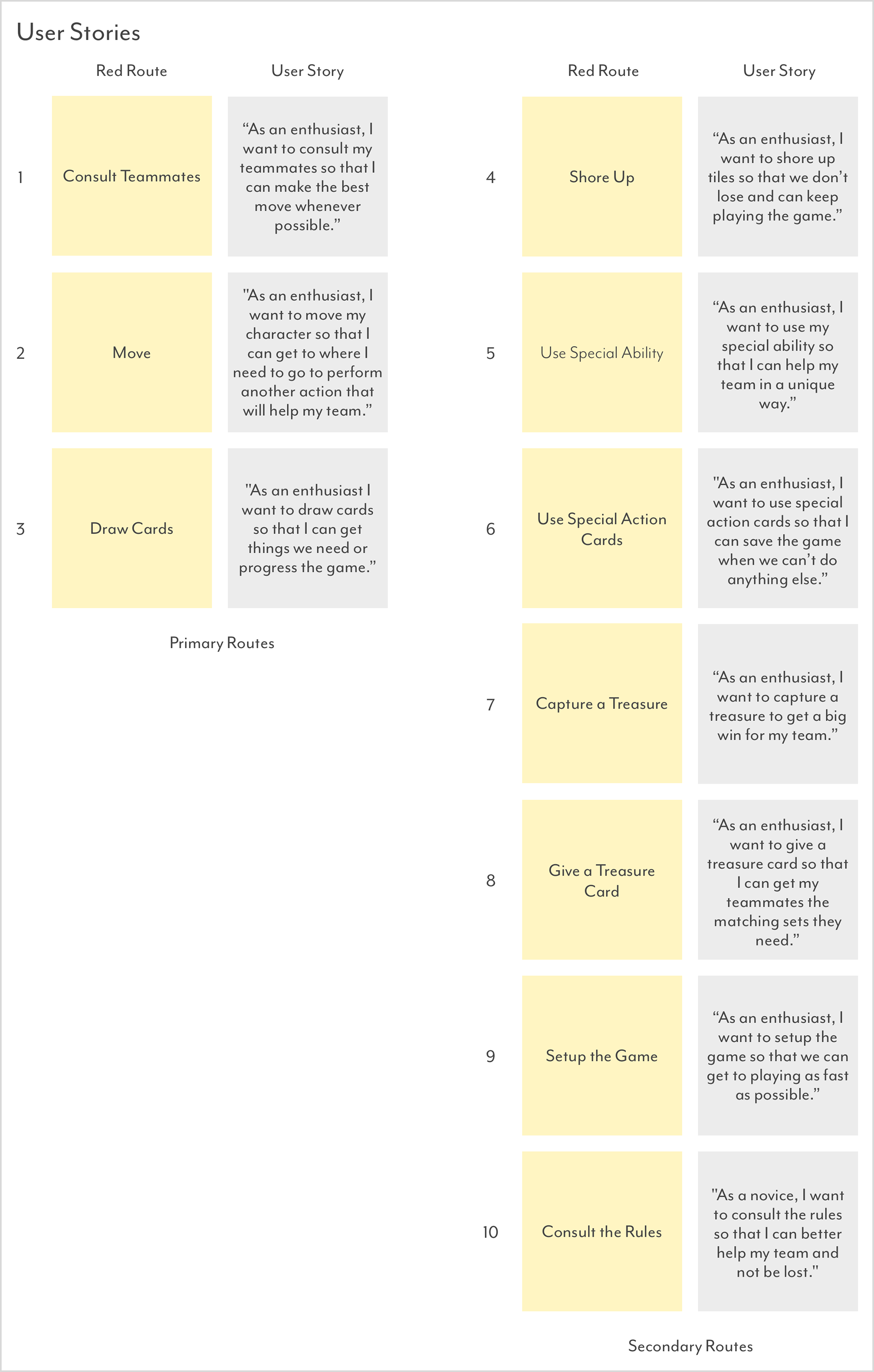

Now that I knew who my users were and what they felt, it was time to explore what the actions they needed to perform in the game. Keeping my primary persona in mind (the Enthusiast), I ranked the major actions by frequency and quantity to find ten key workflows (or red routes), then defined user stories from those. I used the LATCH methodology to explore different types of information architecture that I could apply, and found location and hierarchy to be key. I also found it helpful to map out these key actions into three game phases. At this point I felt pretty comfortable with my user research, so it was time to focus on the design.
Design Research
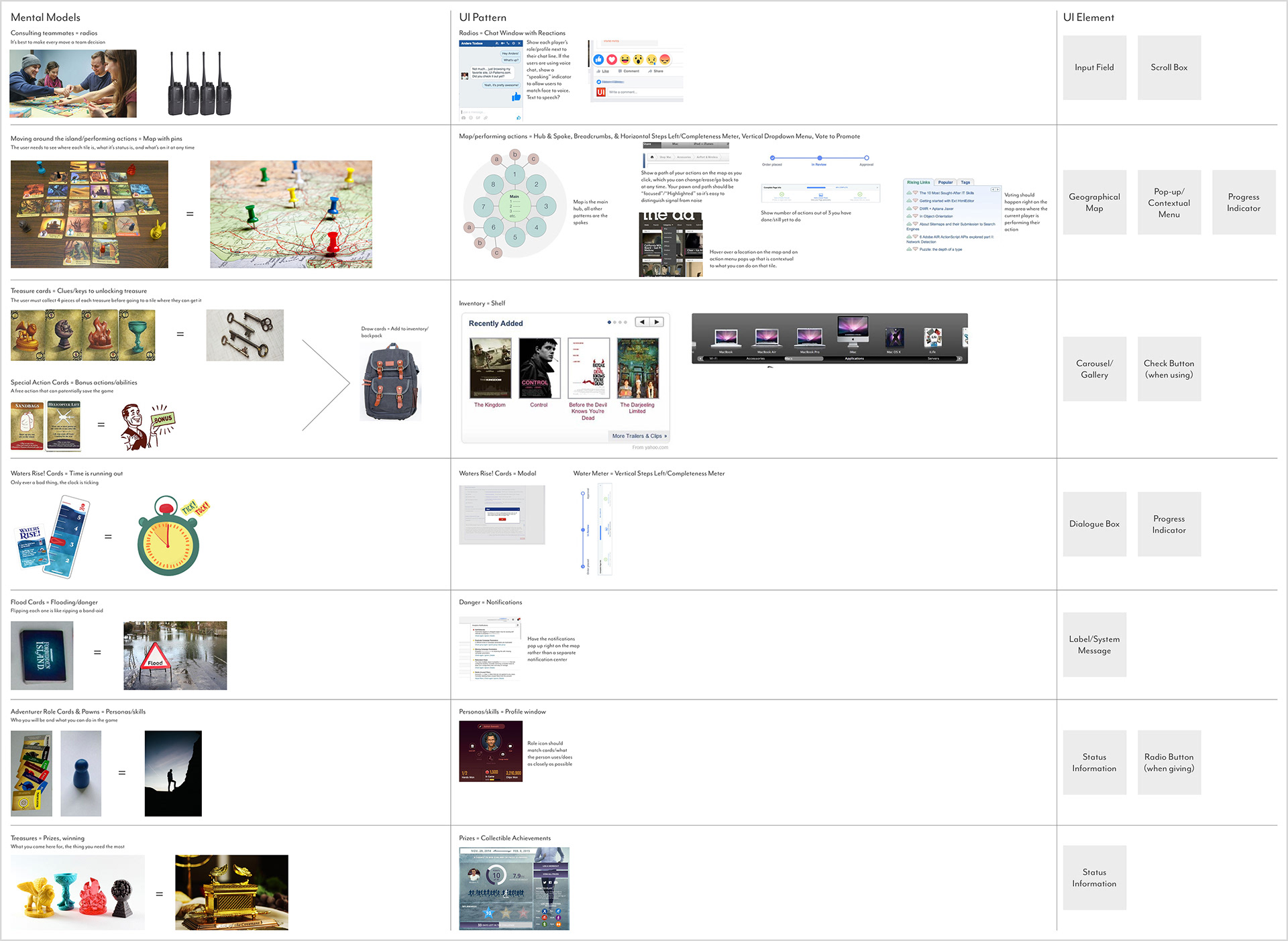
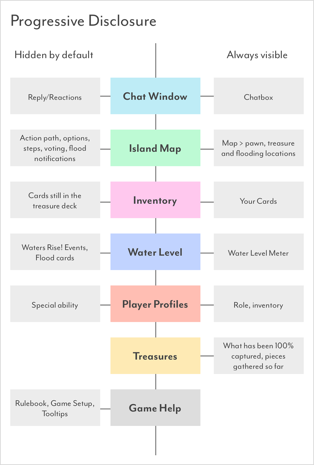
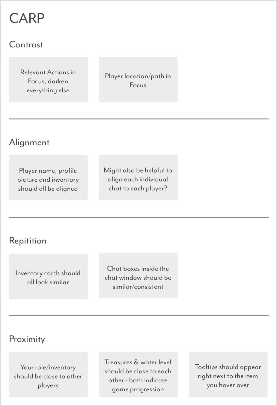
Mental models, in my opinion, are one of the most powerful aspects that can make or break a digital design, especially in this case where a physical model of the game existed already. It was important to me that each piece of the board game had an accurate digital counterpart that could be easily understood by users. So I started with breaking down the idealogical construct behind each piece, then exploring different UI patterns/elements that could be applied to each one. I also spent time thinking about how progressive disclosure and the CARP design principles could be applied throughout my design.

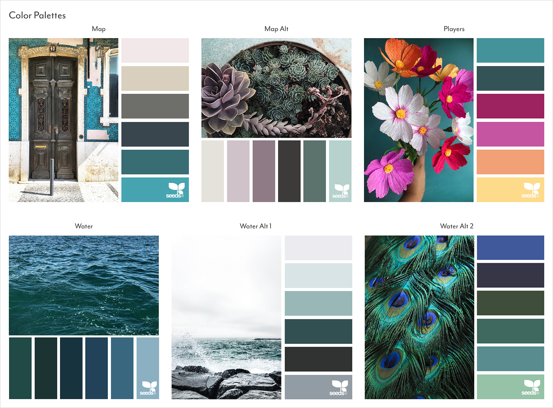
With the design theory out of the way, it was time for the fun part: color and style exploration! The clean, elegant shapes used in Monument Valley and Tokaido Digital really resonated with me. When I played these games, I felt like the simple forms allowed for more precise action and complimented the fluid user experience nicely. But I also wanted to capture the spirit of adventure and excitement of exploring a mysterious island, so the bright colors and active edges found in The Incredibles was a great reference. I also found some excellent color references on Design-Seeds.com, which was helpful for me to see the colors next to real objects and forms. With that, my research was complete, so I grabbed some microns, some paper, and started sketching.
Wireframes


Heavily referencing my design research, I sketched three different potential layouts. The first (left) places the most visual weight on each player and their inventory, but left the actions floating aloof in the top. I also tried grouping the chat by player, but quickly realized this would make a conversation impossible to follow. The second (middle) was the most different, since it divided the screen into four quadrants and gave each player the same visual weight. While it did balance the design the most, it was missing the visual turn order that was achieved by stacking the player boxes, and the greater visual weight to the user's personal player shelf. The third (right) seemed to strike a nice balance of pros from the other two. The full, familiar chatbox in the top left would encourage conversation, the full-size map would make the island as easy as possible to navigate, and the clustered player boxes would make it easy for your team to see what each player had and plan accordingly. This third design is the one I decided to bring forward into my prototypes.
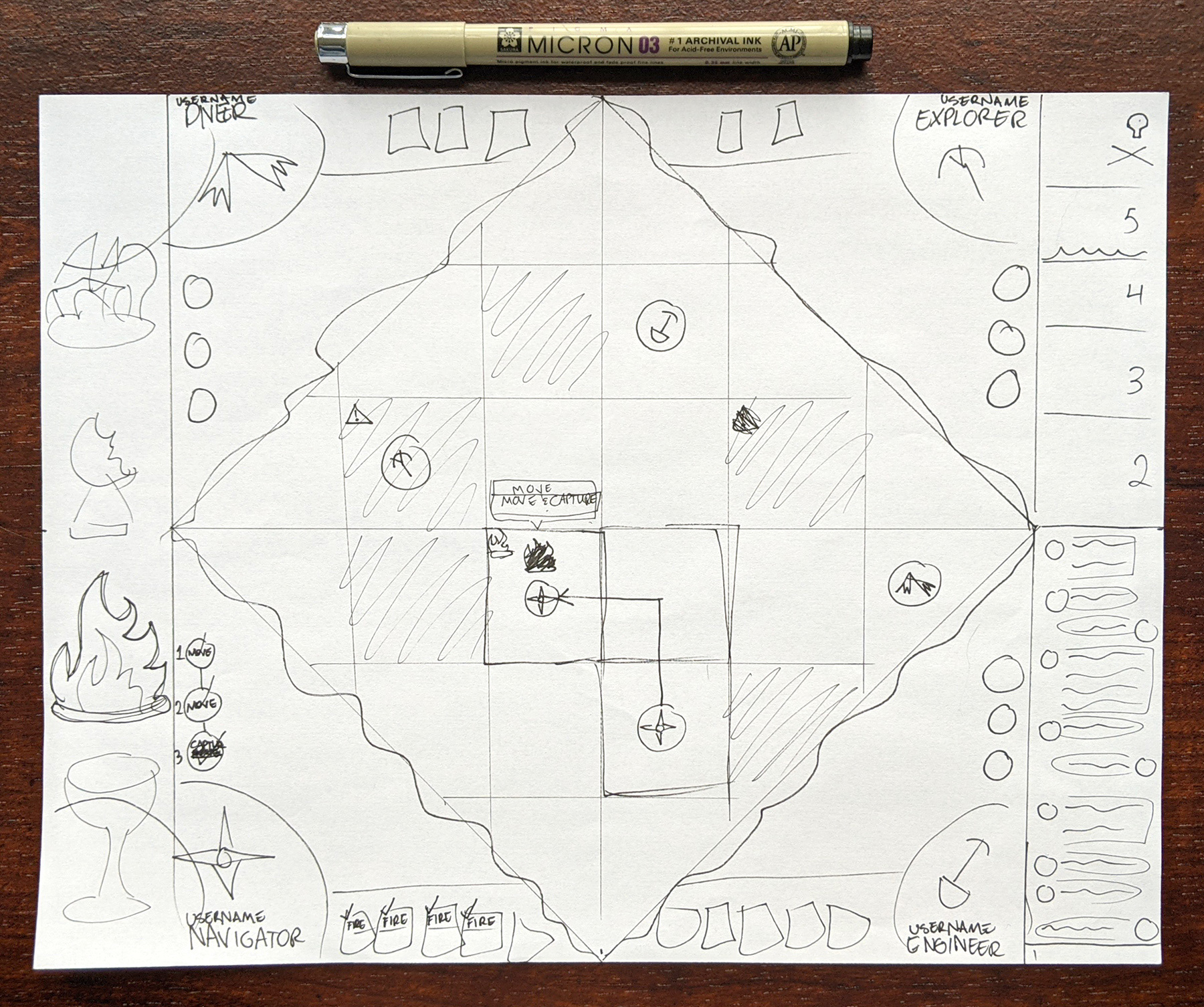
Paper Prototype
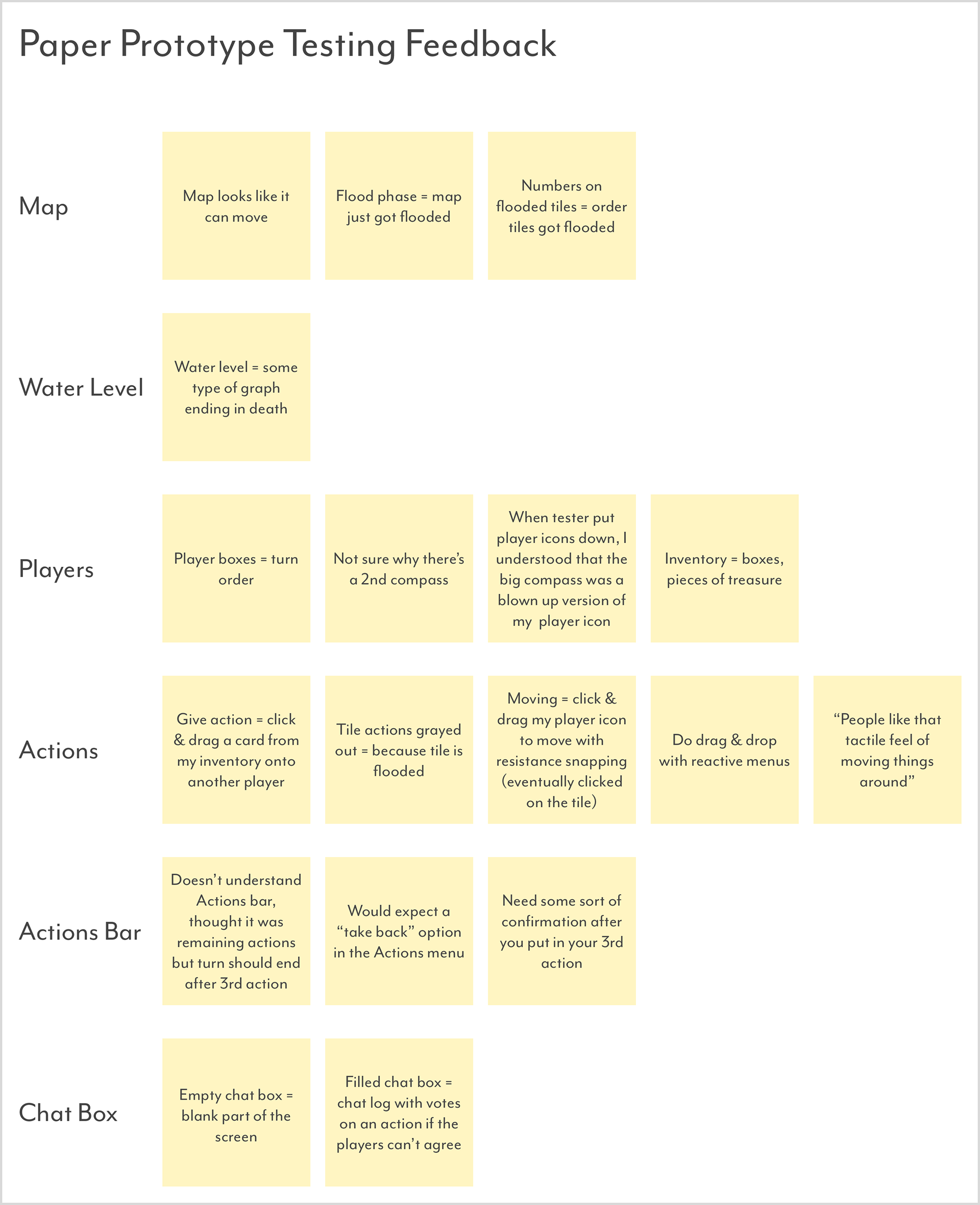
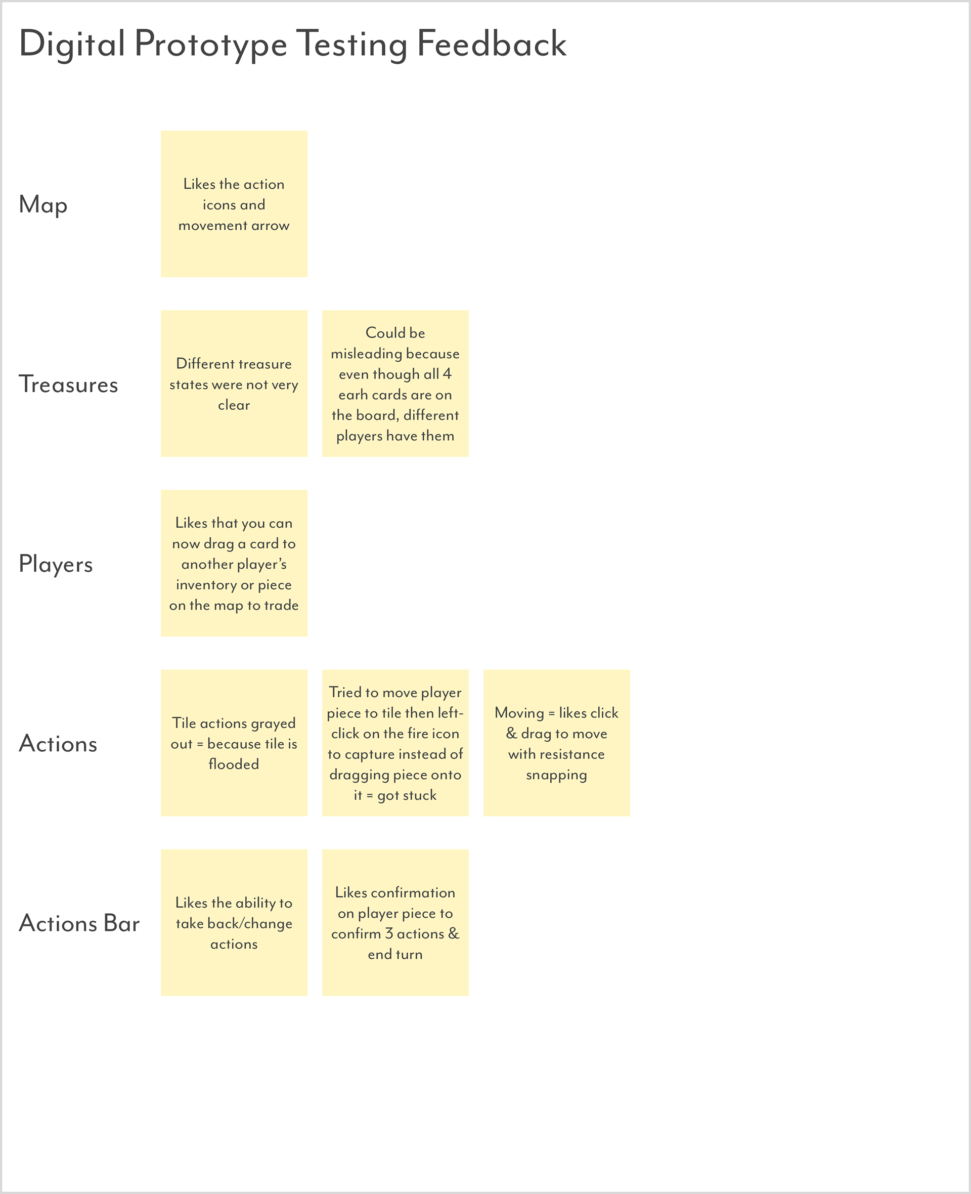
Making the paper prototype was definitely the most fun part of this project. It felt like I was making my own puzzle and putting it together at the same time. I made sure each piece was separate, so that during testing the user could move the pieces easily, but also so I could iterate quickly and change things around if needed. Due to the pandemic, I was only able to test this with one user (my roommate), but I still got a bounty of feedback much sooner than if I had started with a digital prototype. I wrote the feedback on sticky notes during the testing, then digitized them and grouped them according to each feature afterwards.
With the feedback, I was able to decide on this list of changes:
• Make the map outline less prominent in the final visual design
• Add an indication of the turn order/current player’s turn in final visual design (gray out other 3 slightly?)
• Remove the compass on the map
• Make all action interactions drag and drop, with contextual menus that only appear as needed
• Remove the label on the actions bar and make the bar less prominent until you add an action
• Add a confirmation interaction to the actions bar
• Change the "you are about to lose this treasure" warning triangle to a more visible thing in the final visual design
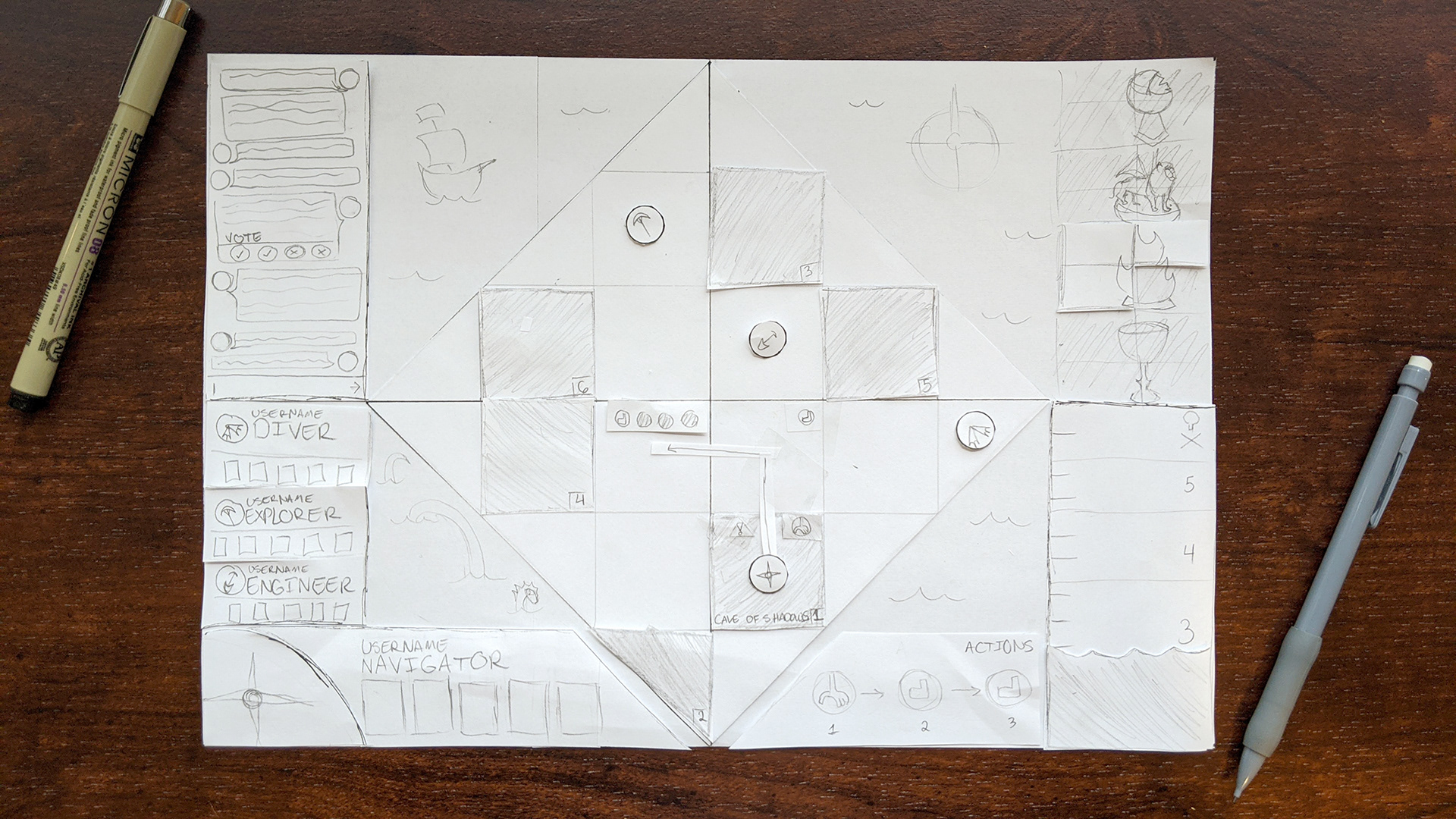
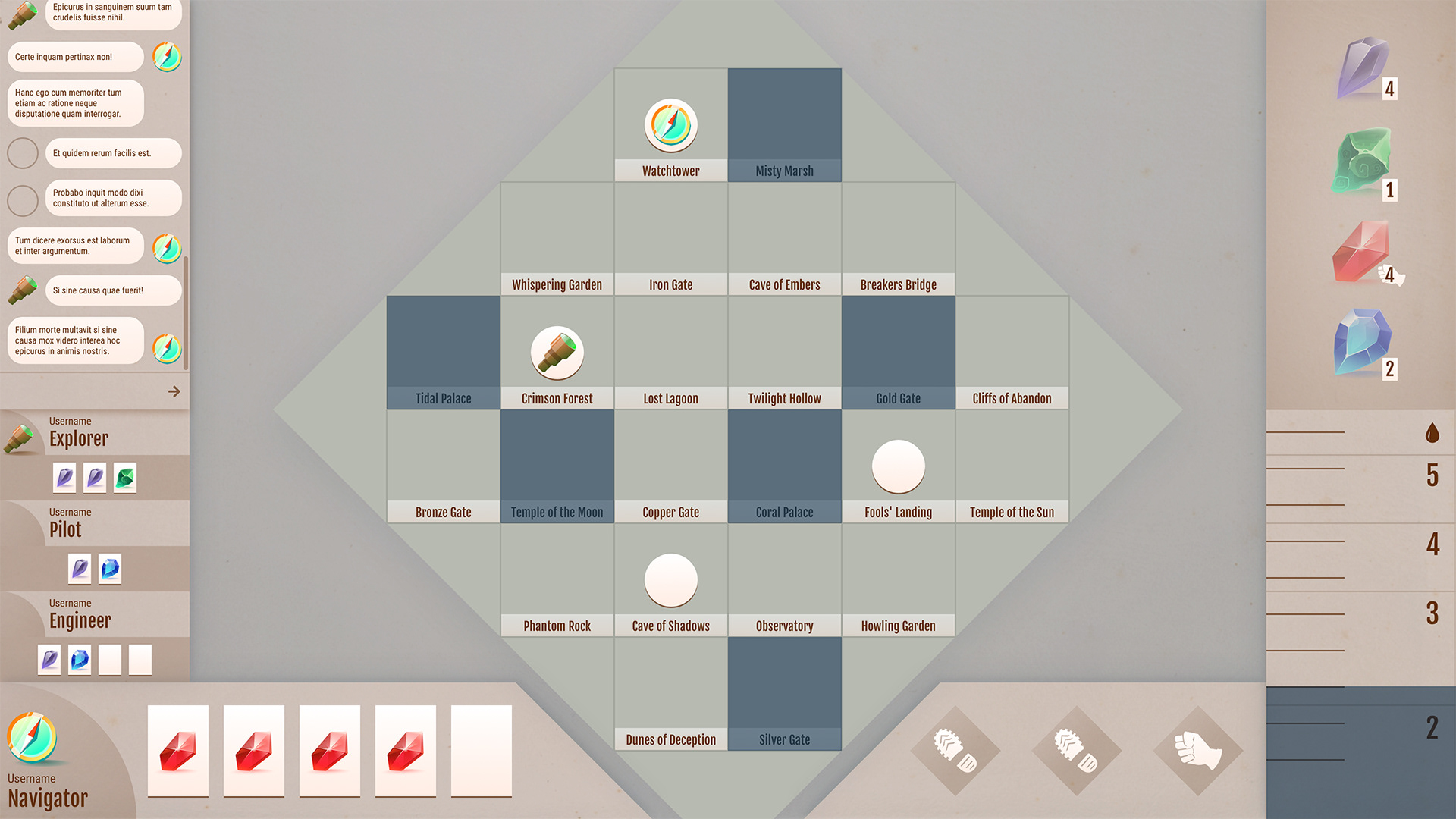
Digital Prototype
Digital Prototype Demo
For the digital prototype, I wanted to make sure that the drag and drop interactions felt as realistic and natural as possible. The prototype allowed the user to drag their piece on the board (the navigator compass) and move it to the tile diagonal to them. If they let go on the tile, their actions and an arrow on the board would automatically show that they are using two moves to get there. If they let go on the fire treasure icon, their actions would show that they are capturing that treasure instead. The user could then confirm their action and end their turn. I also tested the interactions of cancelling an action and giving a card to another player. It was a very simple prototype, but allowed me to test the major interactions in a small amount of time. I organized the user feedback the same way as with the previous prototype.
With the feedback, I was able to decide on this list of changes:
• Treasures: divisions and states seem overly complicated, change to one box with only 2 states per treasure: captured or not
• Treasures: maybe try adding a card counter that changes to a star/highlight when the treasure is ready for capture (one person has all 4 pieces)
• Capture action: Change to a left-click on the treasure icon to capture the treasure. This keeps the movement hit region large, and performing all other actions consistent (i.e. left click a tile to shore up)
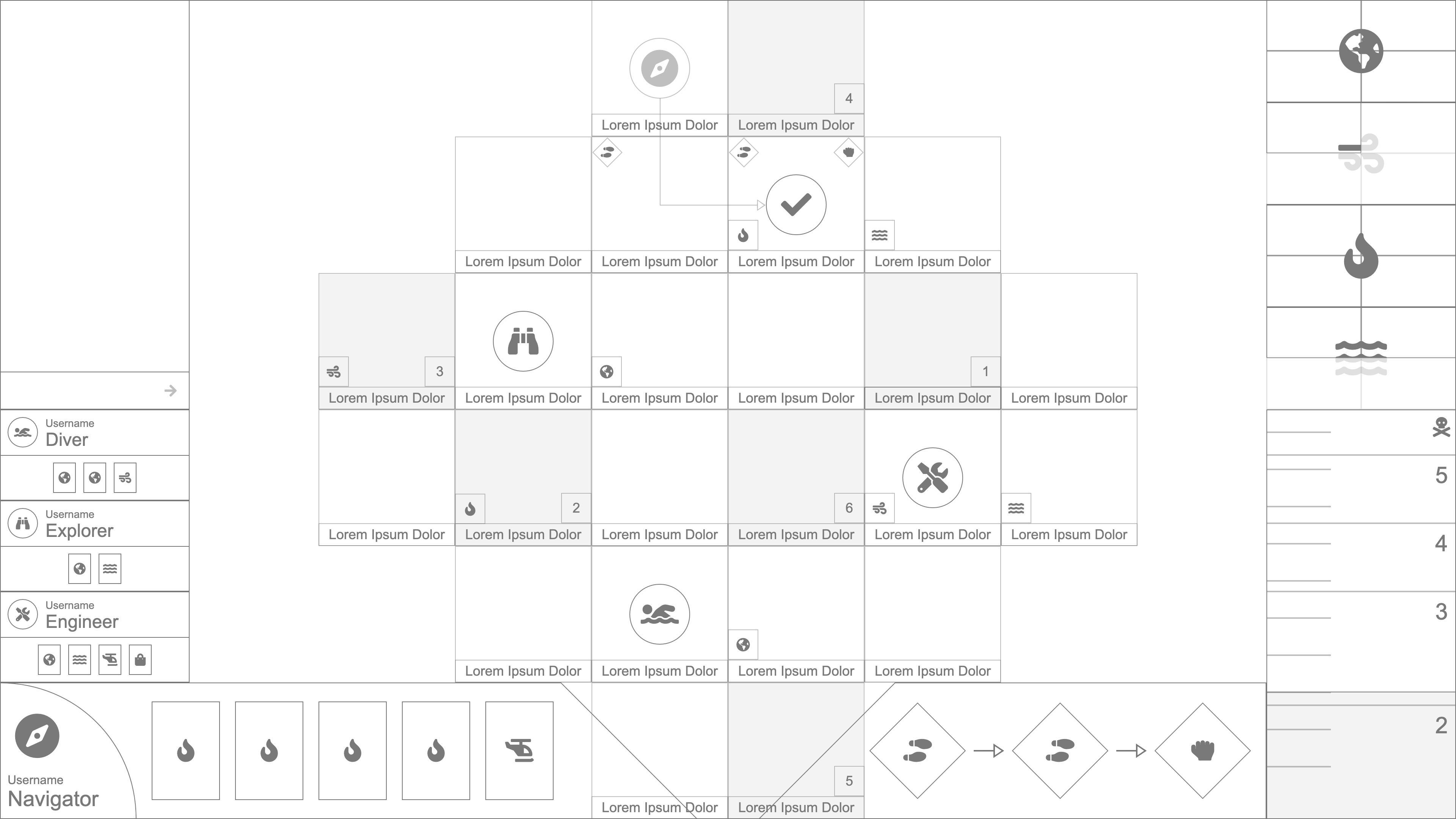
Interface Designs
Version 1

Version 2
Custom Player Icons
With my UX testing complete, it was time to work on the visual design of the UI. Both versions of the interface that you see above have the exact same layout that I proved during testing, but they have very different colors and a few different shapes.
In the first version, I used the more pastel tones from my color palettes. I quickly found the colors to be too muted and not indicative of the bright, adventurous spirit I was going for. The angles of the elements also felt inconsistent, since I used a blend of rounded and sharp edges.
In the second version, I brought in brighter, more saturated colors, made all the angles sharp, and added some visual accents like subtle gradients and the shines across the panels. I also created some custom icons, starting with the player pieces. Contrast between what was interactive and what wasn't in the design was important to me, which is why I decided to make all the player pieces and cards not only light but colorless, compared to the dark, saturated backgrounds.
The final visual design is still a work in progress. The treasure/card icons are placeholders, and I hope to eventually add much more detail and personality to the tile icons. I also want to revisit the colors one last time to brighten them up even more – the design as is seems like it doesn't have enough contrast between the player colors.
Project Reflection
This project was a great way for me to apply my UX/UI expertise to game design. I studied game design throughout college and worked on many game design projects in the past, but never through the lens of a professional UX/UI designer. After doing so with this project, I'm eager to continue exploring how the UX/UI process fits into game design and create more user friendly games.
What I Am Most Proud of:
• Execution of the entire UX/UI process from start to finish.
• Research and application of new research/design methods and resources.
• Testing and iterating on the design early and efficiently.
• Execution of the entire UX/UI process from start to finish.
• Research and application of new research/design methods and resources.
• Testing and iterating on the design early and efficiently.
What I Would Do Differently Next Time:
• Design a tutorial/out of box experience.
• Add more interactions to the digital prototype and test them – particularly drawing cards and sinking the island.
• Add more animations to the digital prototype to test how they would enhance the user experience – such as the waters rising or a congratulatory animation for capturing a treasure.
• Add more detail/layers of intricacy to the visual design, especially to the island tiles.
• Test the visual design, especially for accessibility.
• Do a deep dive into gamification and the octalysis framework, use the findings to push the design further.