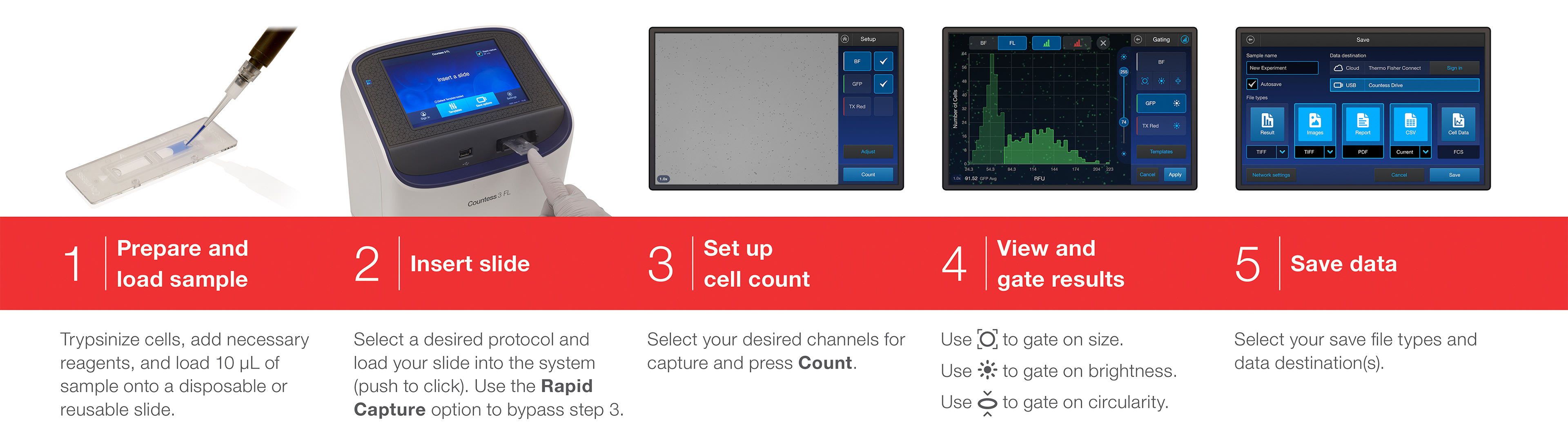
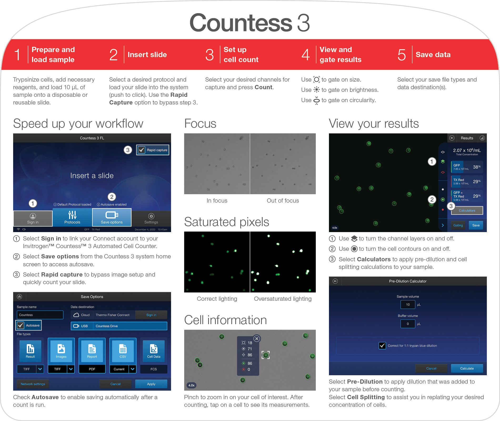
Cell Counting in Five Steps
Project Overview
The Brief:
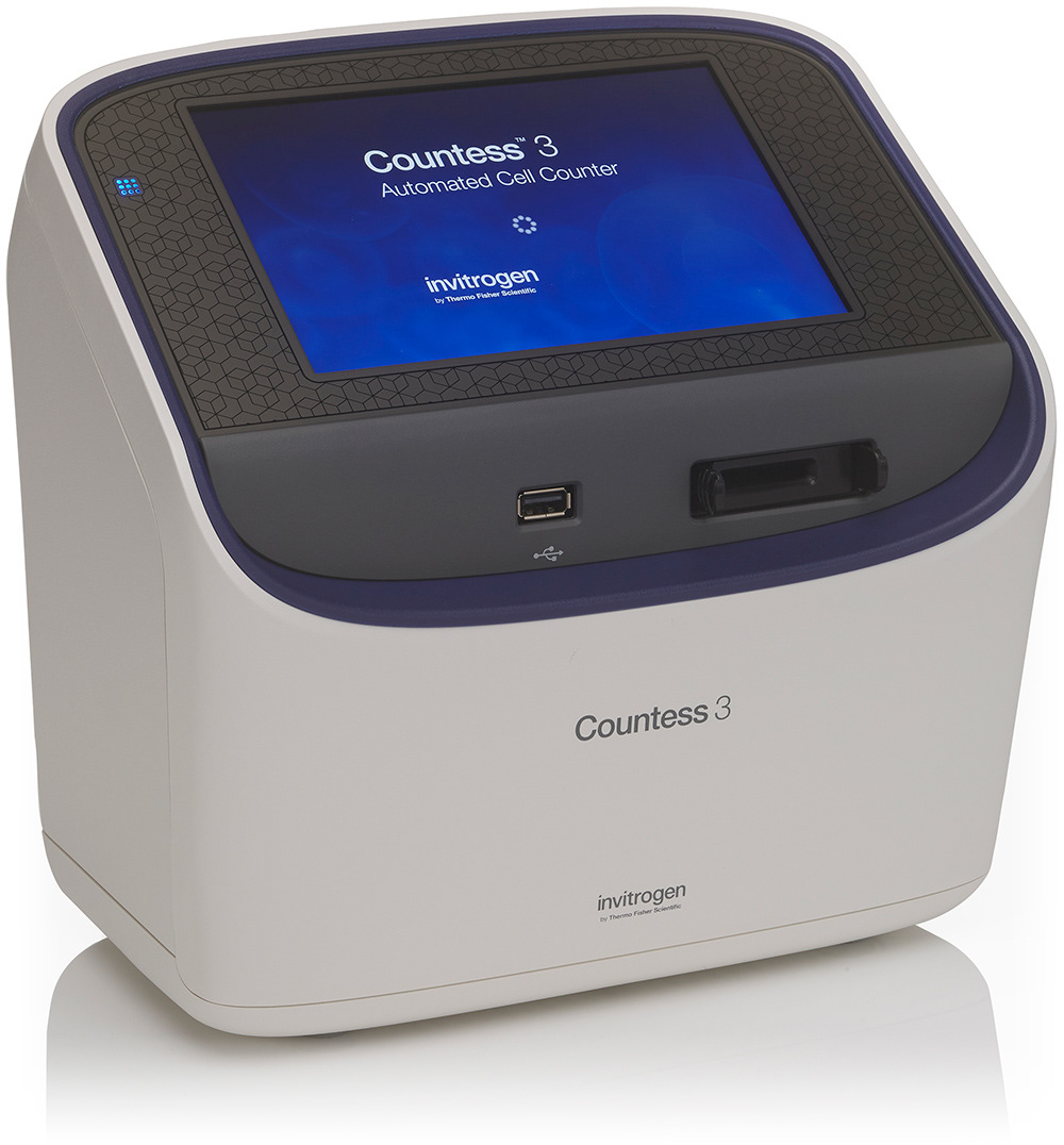
To design the user interface for the third generation of the Countess with improved usability, graphics, and workflow speed.
Results and Business Impact:
• The Countess 3 received an excellent System Usability Scale (SUS) score from our final usability testing led by our user research team.
• The instrument exceeded its launch sales forecast.
• The instrument exceeded its launch sales forecast.
Key Tools and Deliverables:
• Used Sketch and Abstract to create initial concepts, iterations, a modular symbol library, style guides, final page mockups, and assets.
• Used Axure to develop prototypes for internal testing and interaction/animation handoff for the developers.
• Used Zeplin to provide final designs specs and SVG assets to the developers.
• Used YouTrack to collaborate directly with developers during UI implementation and provide feedback on user stories for each sprint.
• Used an in-house software simulator and physical instrument prototypes to review each iteration of the UI and work through design fixes with the developers.
• Used Adobe InDesign to design a quick reference card. This is a one page, sturdy printed card that scientists can hang above their bench for quick reminders while using the instrument.
What I Did:
As one of two UX/UI designers on the project, I:
• Developed and iterated on workflows and wireframes.
• Created a number of UI redesign options based on those wireframes and the Countess II UI, of which one was ultimately chosen as the new design for Countess 3.
• Fleshed out a Countess 3 style guide based on the latest Invitrogen brand style guide, including colors, typography, icons, and interactions.
• Designed over 150 screen layouts that included new control types (flyouts, layered sliders, full-screen graphs).
• Created digital prototypes for testing these new control types and to also allow the developers to interact with them and view the intended animation timings.
• Participated in usability testing, after which I iterated on the designs and helped the developers implement over 30 changes in 3 weeks.
• Provided documentation and marketing support (feedback and review) up until launch day.
• Worked closely with another internal design team to develop the Countess 3 cloud app, which would allow our users to export their counts from the instrument to our online app, freeing up their instrument for their lab-mates.
• Immediately started reviewing existing screens and developing new screens for future updates to the software.
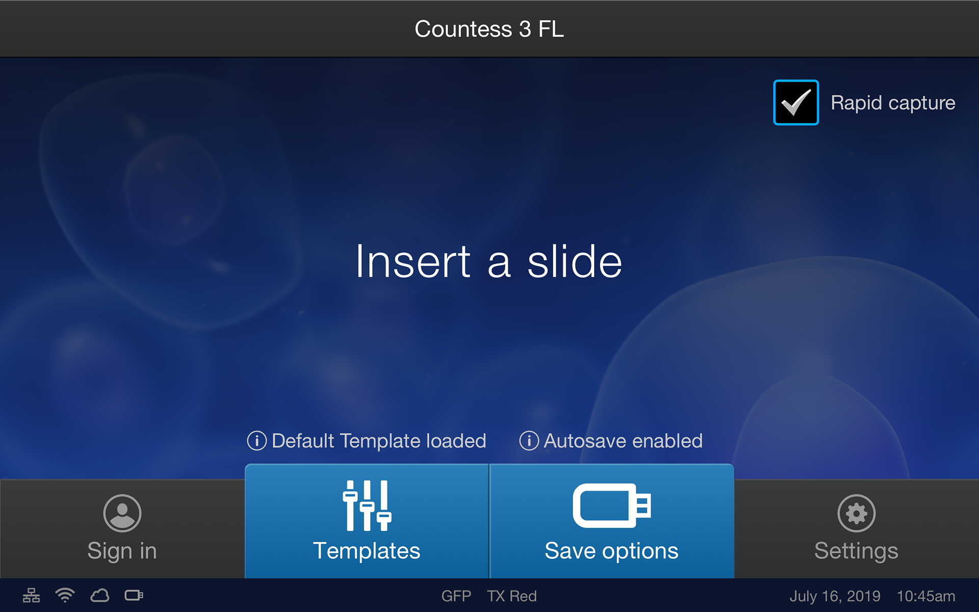
Workflows & Wireframes

Using the Countess II interface as a starting point, we did a deep dive into what parts of the workflow worked well and what could use improvement. Our goal was to strike a balance between introducing changes that were meaningful without making it feel like an entirely new instrument that our users would have to re-learn. We also introduced new workflows like connecting to our cloud platform, an additional calculator, and rapid capture.
Interface Designs & Iterations
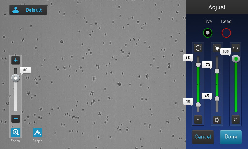
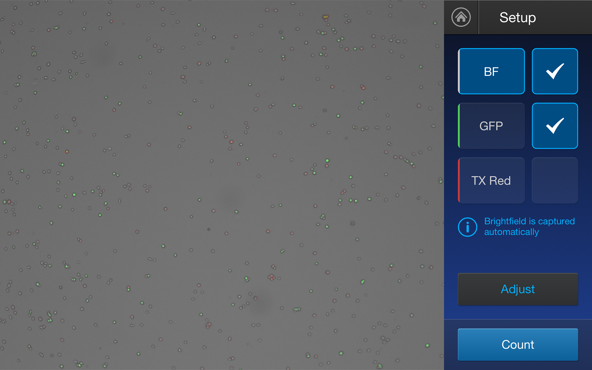
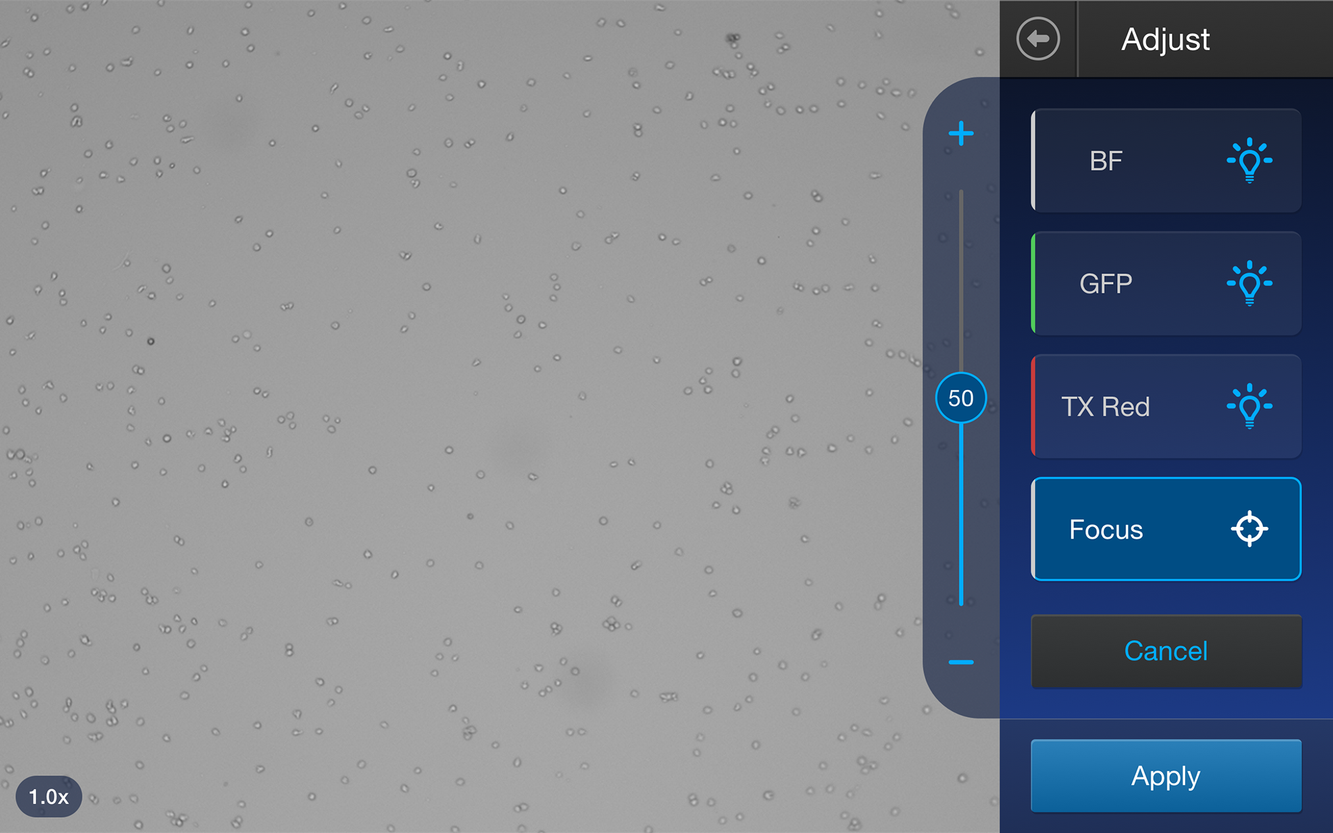
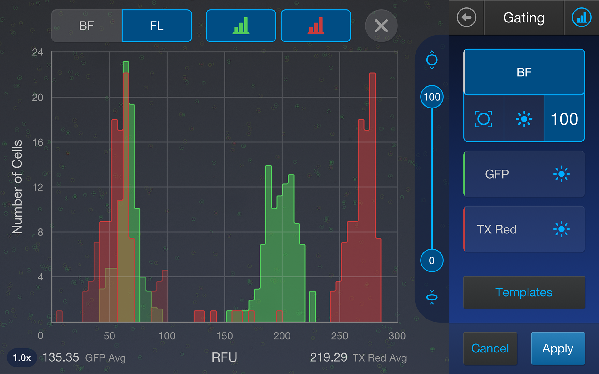
With our wireframes complete, it was time to dive into the interface design. I think my biggest challenge throughout this design was fitting the image controls inside a 320px (1.5") wide gutter.
In the first version, which followed a similar layout to the Countess II, I was not happy with the size of the hit-boxes and small range of the sliders. The controls were clustered and it was easy to hit the wrong one, especially when the user's vision is primarily focused on the image area to the left.
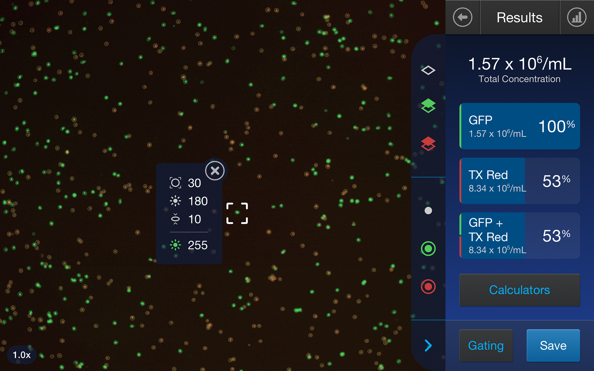
I knew there had to be a better way, and in version two I found it. The radio buttons were small and nondescript, so why not use our larger vertical space and make them tabs with plenty of space for the channel name? As for the sliders, let's take advantage of our vertical space again and pull it out just to the left as one long slider. I did receive some push-back for this at first since the slider now covered the image area, but since you could easily close this page and see the full image again, our team conceded that the trade-off was worth it. The final advantage to freeing up space in the gutter was being able to show any percents or data right next to the channel name as well, instead of having to tap on the slider thumbs for a small popup.
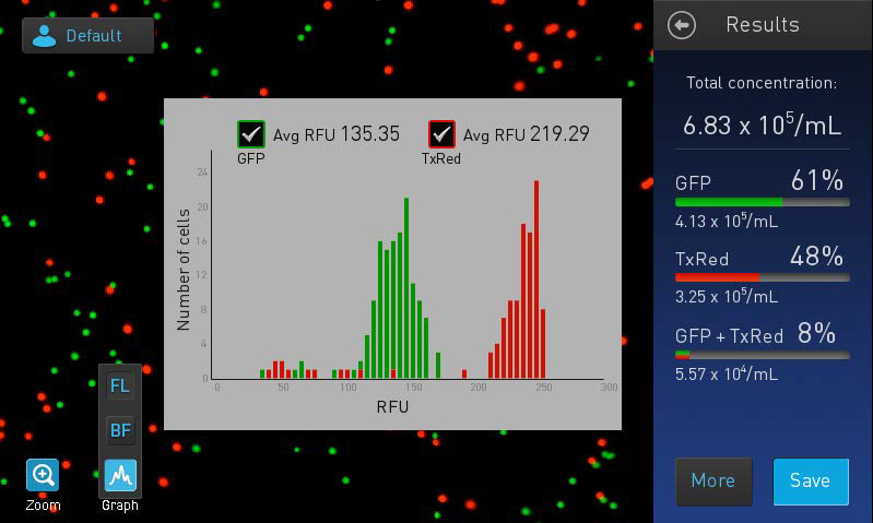
Version 3 was mostly visual refinement and unifying the design as much as possible. The thin percentage bars on the Results page felt too insignificant, so I decided to maximize the vertical space once again and make them a full background behind each channel's text block. This also helped give more visual separation to each unit of data.
Our fourth iteration involved final touches to the home screen, minimizing the square color indicators to thin lines, and showing only the current number while gating. These minor changes gave even more breathing room to our small gutter.
My fellow UX designer on the project tested each redesign with our internal scientists using paper prototypes, and by the time we reached the fourth iteration, we knew we were ready to move on to digital prototypes.
Prototypes & Animations
My first prototype (made in Adobe XD) was an exploration of potential gutter animations. It involved a lot of motion: buttons expanded and the the sidebar slid in and out from behind the gutter. With this, the team was able to quickly decide on a more subtle approach of cross-fades for the gutter & sidebar transitions.
My next prototype (created in Axure) was much more advanced. The intention was to show our whole team exactly what the transitions would look like in the final app, as well as to hand-off precise animation timings to the developers. It contained draggable sliders connected to live values, toggles on/off, screen transitions, and every other interaction throughout the software.
Usability Testing
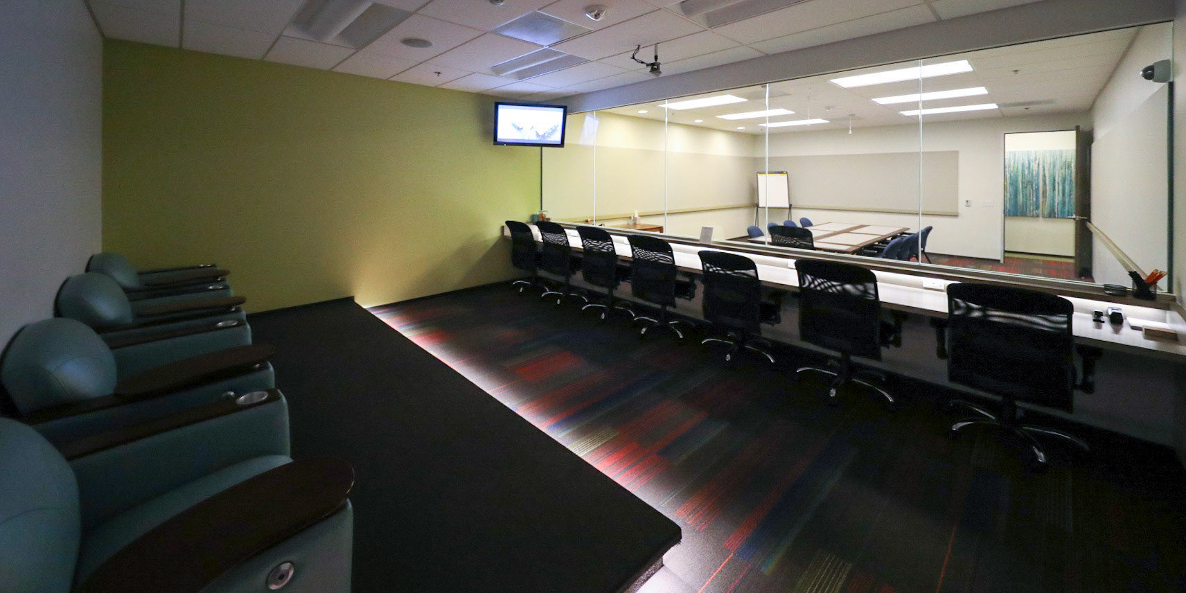
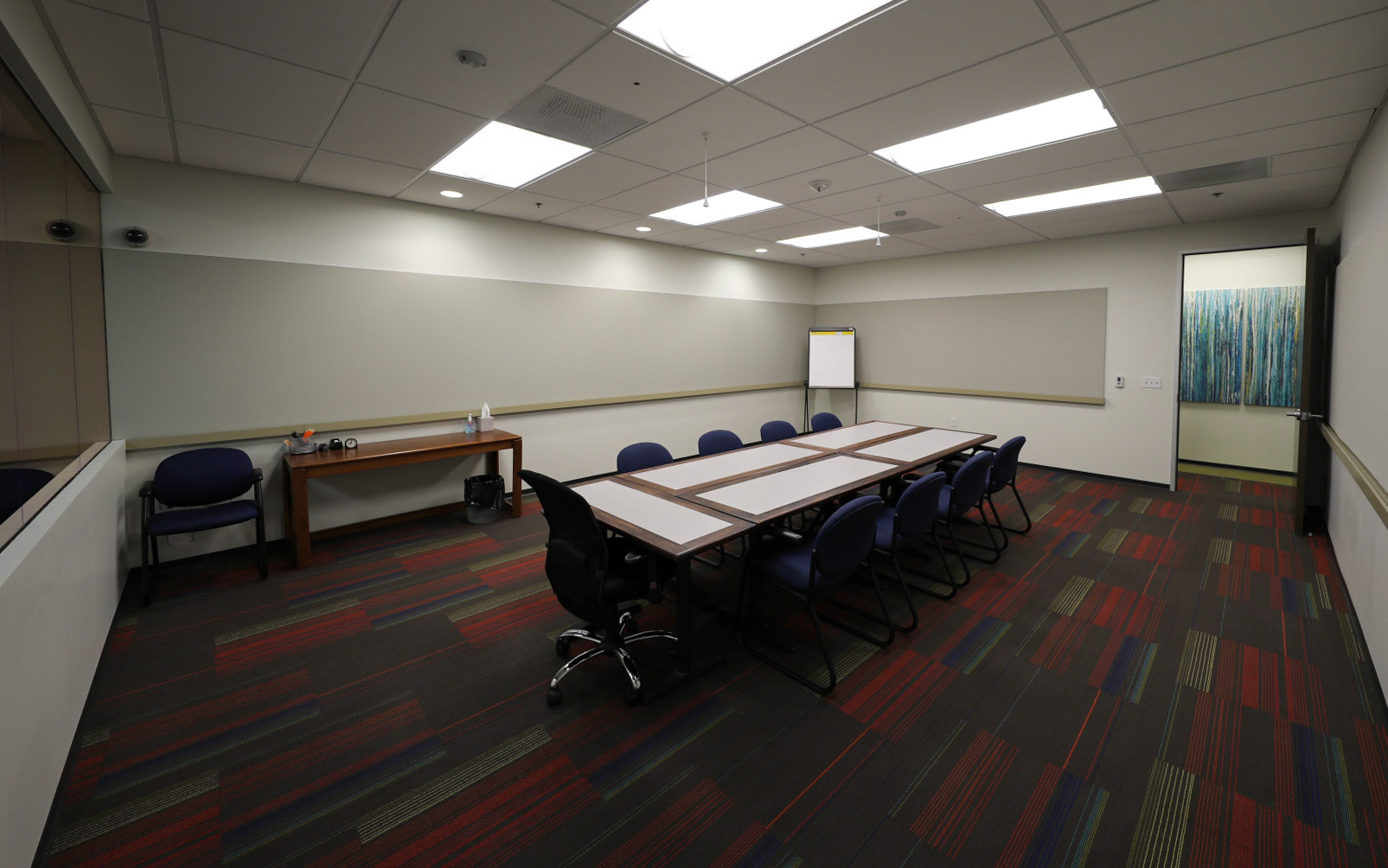
Testing was held in a prepared room with a one-way mirror, and a representative from each function of the product team attended. Our user researcher posted up large papers all around our side of the room that would house our sticky notes taken during the testing, each with a different focus (usability issues, questions, positive comments, etc.). Everyone on the team was very engaged in both taking the notes and discussing them in-between each participant. We had an entire list of agreed upon changes and bugs entered into the developers backlog by the end of the two days of testing.
This was my first professional testing experience, which really taught me the value of observing feedback directly from users. I also learned that people love sticky notes, which I now consider as the most important usability testing tool for team engagement.
Final Interface Design
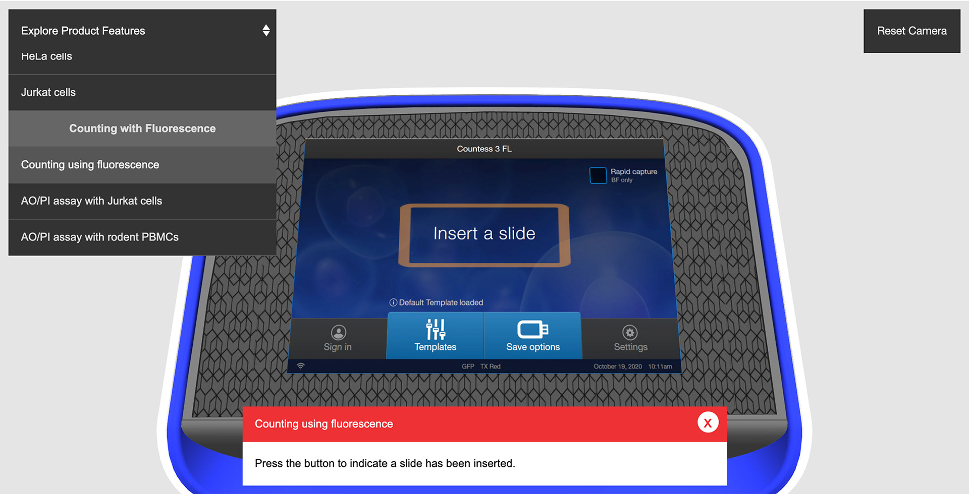
Visit the Countess 3 webpage and click the "View virtual tour" button to interact with a virtual tour of the UI. I recommend selecting the "Counting using fluorescence" and "Using histograms to gate" product features.
Three weeks and 30 changes later, we had completed our final interface design. Hit regions were increased, new features were added (cell info popup and zoom number), colors were adjusted, slider designs were unified, and more. I felt really confident knowing our work had been validated by users, and that our team spent time discussing and interpreting the feedback instead of blindly acting upon it.
Developer Handoff - Style Guides and Specs
I prepared four detailed style guides for the developers as a one stop shop for everything they might need, in addition to the 150+ screens I had already uploaded to Zeplin throughout the design process. These included an icon sheet, button and control type outlines with every possible state, and a color guide. I made sure each element provided appropriate code specs, contained a clean downloadable SVG, and had links/comments that explained any intended interactions or animations.
But it was important to me that my involvement didn't end there. After the initial handoff, I attended developer sprint stand-ups and followed along with their kanban boards online. We often met to discuss how an asset's design should be broken down in the code, or how to improve the path data of SVGs I had created. There were also several unhappy paths that were never accounted for (errors, field validation, etc.), so we worked together to flesh-out those workflows. We built a very mutually beneficial relationship between our two worlds. I learned a lot of valuable information about our development process and how to better prepare my work for handoff in the future.
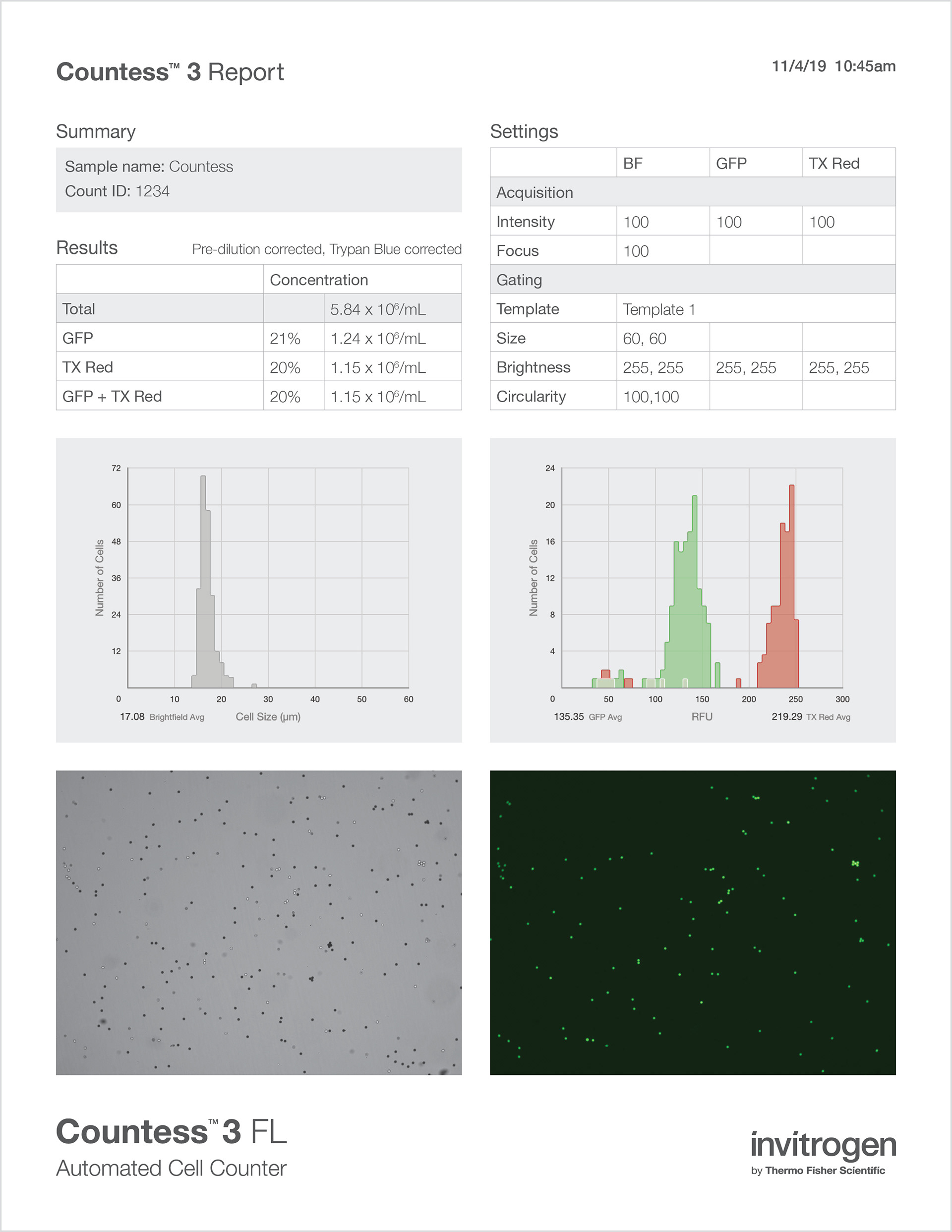
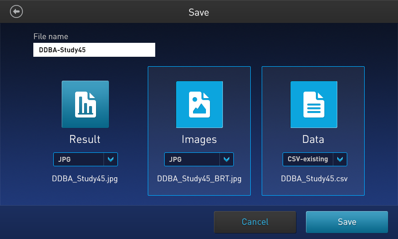
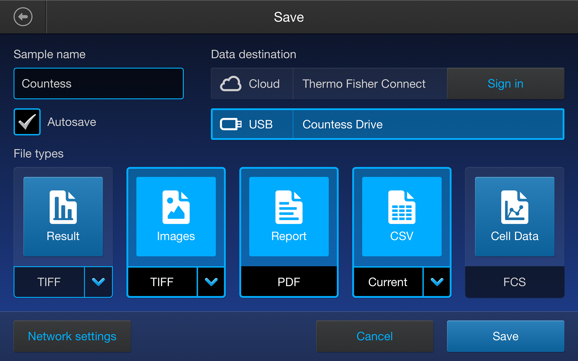
One of the most important save file types is the report PDF. I mocked up the report in Adobe InDesign, then worked very closely with a developer to convert it into a PDF generated entirely by code. When the user hit "Save", this report was automatically generated based on their current count data. It was a new experience for both of us, and we were both very pleased with the end result.
Quick Reference Card
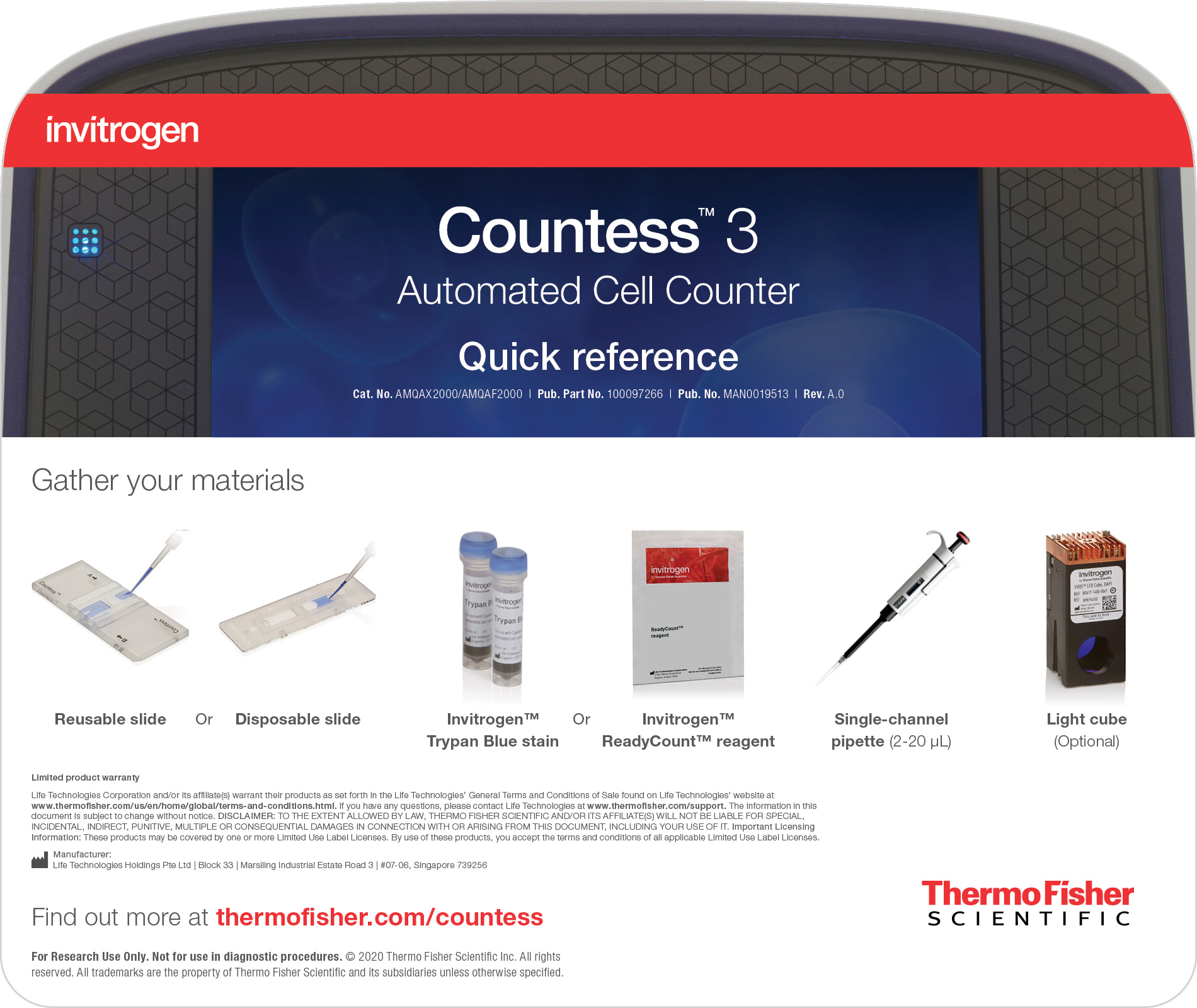
Front
Back
Shortly after UI handoff, I was requested to make a quick reference card that would lay at the very top of the product package. This card would explain the entire counting workflow and highlight key features - all in the space of 8 x 9.5 inches (front and back) so that it could easily be hung above the Countess 3 on scientist's lab bench. I also helped review product manuals, marketing brochures, website graphics, and more.
Project Reflection
This project spanned exactly two years for me – when I first started at Thermo Fisher Scientific in late 2018 to the end of 2020. Along the way, the project team fluctuated, a global pandemic started, and I learned how to translate my designs assets into a new coding language I'd never heard of. This was also my first opportunity as a UX/UI designer to be involved in the whole process from start to finish, and my first in-person usability testing. The amount of experience I gained during this project was insurmountable and very pivotal in my growth as a UX/UI designer.
What I Am Most Proud of:
• Working with a team of people that was efficient, engaged, patient, and most importantly, open-minded.
• Making mistakes, learning from them, and fixing them quickly.
• Being heavily involved throughout the development process and adopting my mantra of making my designs more user and developer friendly.
• Designing efficient control layouts with only 320px of gutter space.
• Creating a clean & easy to use symbol library for 150+ screens in an agile environment.
What I Would Do Differently Next Time:
• Wireframe all the unhappy paths up-front.
• Discuss with developers from the get go what coding language & platform they are using.
• Advocate for more user testing, especially near the beginning – more user data to inform my designs could have led to faster/fewer iterations.
• Wireframe all the unhappy paths up-front.
• Discuss with developers from the get go what coding language & platform they are using.
• Advocate for more user testing, especially near the beginning – more user data to inform my designs could have led to faster/fewer iterations.